
Transforming In-App Messaging
Creating a modern in-app messaging experience
Problem
The messaging feature in 7shifts was outdated, not real-time, lacked essential features, and received numerous negative reviews. Many users were switching to other messaging apps for their communication needs.
Solution
We modernized the messaging feature by breaking the project into smaller phases, aligning it with current standards and user expectations.
Role
I served as the Product Designer, leading the entire design journey. I conducted research, created wireframes and prototypes, and collaborated with developers during implementation. I also provided mentorship to a junior designer.
Team
Product Manager, Product Designer, Engineering Manager, 4 Developers, Product Marketing Manager
My Process
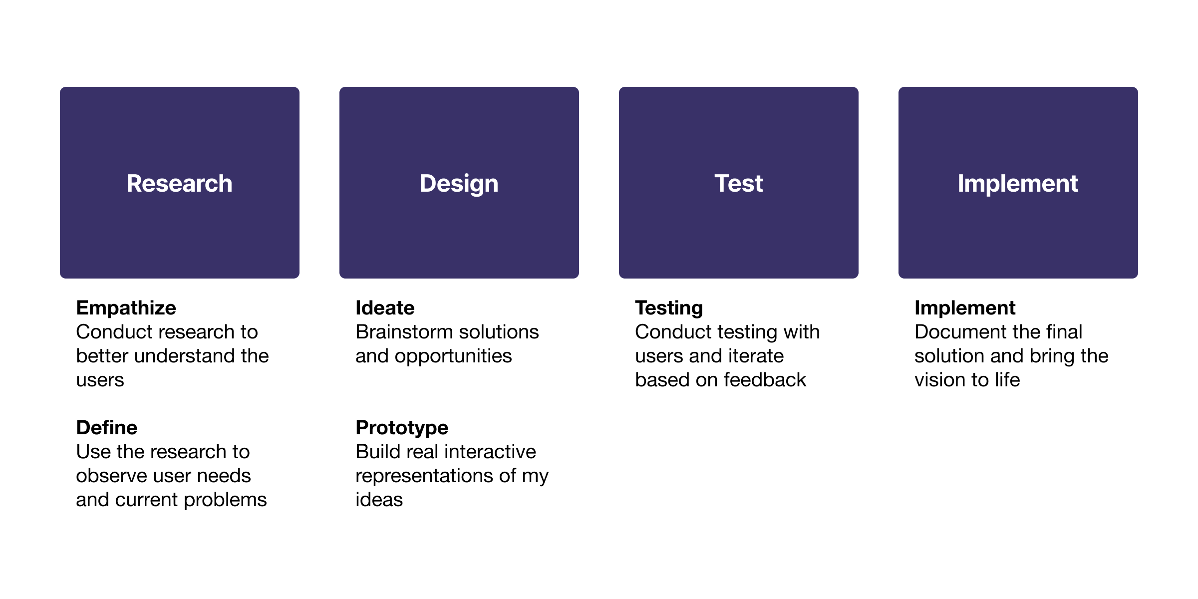
My process revolves around deeply understanding the user and their needs. This involves research, ideation, and validating solutions for the current problem.
Research
Interviews
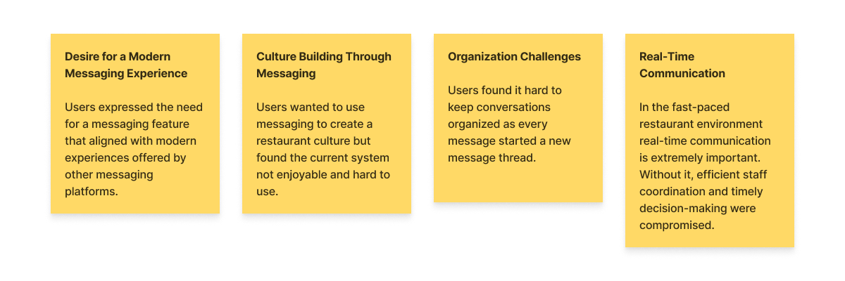
We conducted interviews with restaurant staff to collect valuable feedback, enabling us to uncover and understand users’ pain points and demands.
Pain points and demands:
Desire for a Modern Messaging Experience: Users expressed the need for a messaging feature that aligned with modern experiences offered by other messaging platforms.
Culture Building Through Messaging: Users wanted to use messaging to create a restaurant culture but found the current system not enjoyable and hard to use.
Organization Challenges: Users found it hard to keep conversations organized as every message started a new message thread.
Real-Time Communication: In the fast-paced restaurant environment real-time communication is extremely important. Without it, efficient staff coordination and timely decision-making were compromised.
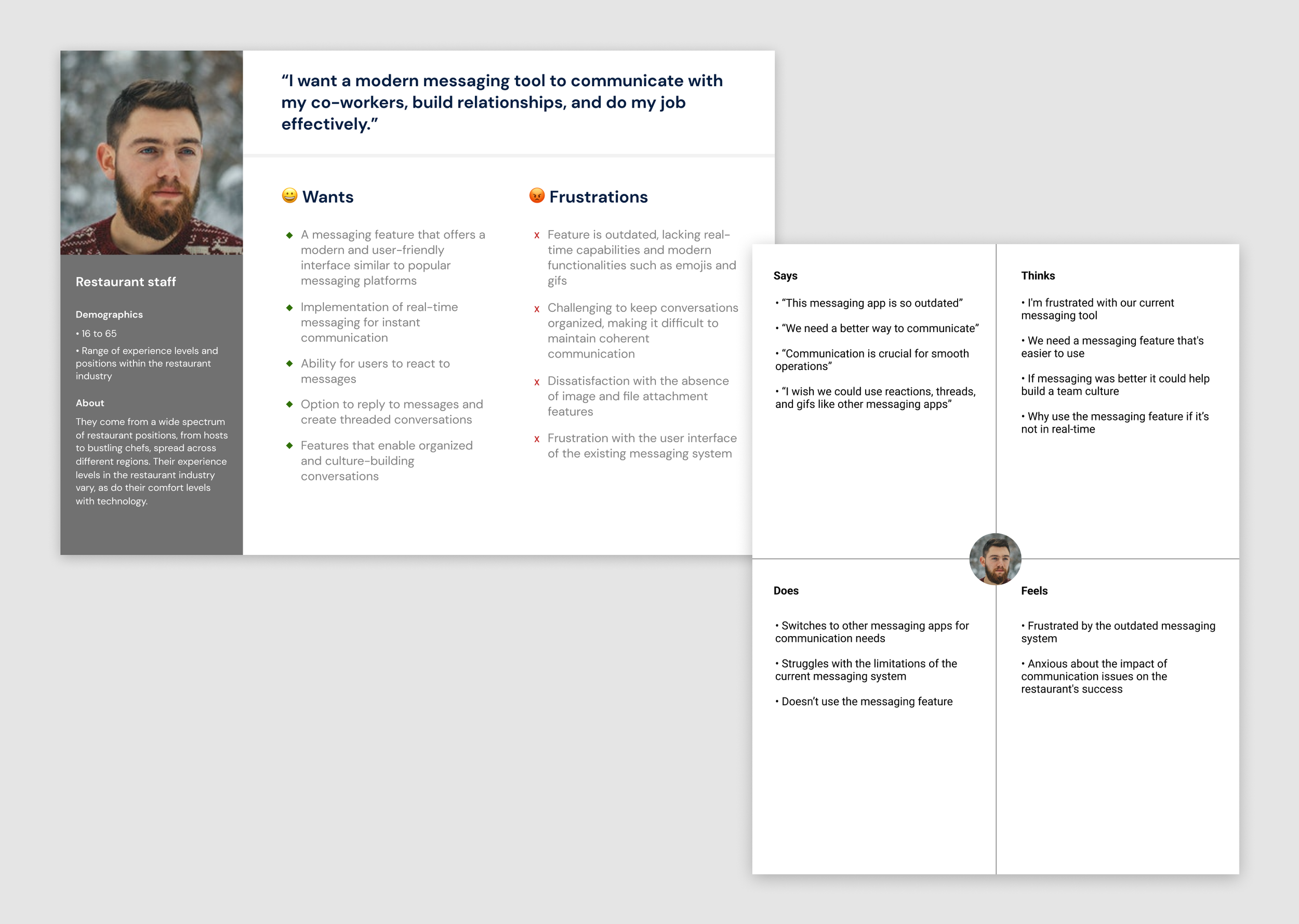
Persona and Empathy Map
Using the insights we gathered, I created a user persona and empathy map for our team to gain a deeper understanding of our users and their needs.
“Would love to just use one tool for staff communication. 7shifts has a chat but it’s unreliable and we need more for our communication needs. ”
— 7shifts customer
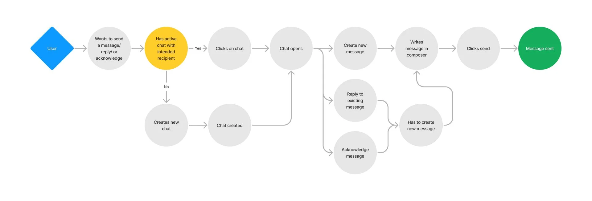
User flow
I created a simple user flow to help understand the existing messaging process and shared it with the team. This made it clear how rigid the feature was for users.
Survey
We wanted to see how well our current messaging feature was working and find out what additional features our users were interested in. Together the marketing manager, product manager, and I created a simple survey. From the survey results we identified what features should be prioritized and created benchmarks to help us measure if new releases were successful or not.

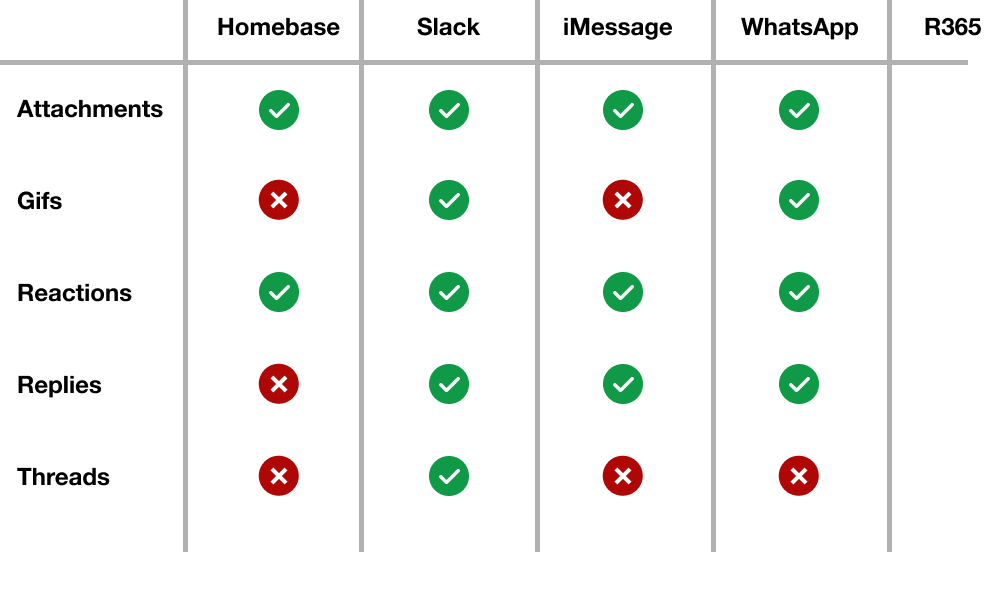
Competitive analysis
I researched and studied modern messaging platforms, analyzing their common features, and identifying best practices. I also closely examined our competitors to gain insights into their messaging solutions and strategies. This analysis allowed us to align our messaging feature with industry standards.
How might we make the messaging experience more reliable for restaurant staff?
More challenges
In our efforts to align our messaging feature with the needs of our users, it became evident that achieving this goal would require a significant amount of work and testing. With time and resource constraints, we searched for a library or external service that could expedite this process. As a team, we explored different options and decided on one after careful evaluation.
This decision introduced a set of new challenges for us to navigate. By using an external service, there was a risk that the design might not seamlessly integrate with our existing design system. We also understood that the customization and control would depend on the capabilities and limitations of the third-party solution.
I used my development experience to review the documentation and found that the service offered extensive customization options. This allowed us to tailor the components to align with our user experience while maintaining consistent 7shifts styling.
Design
Wireframes
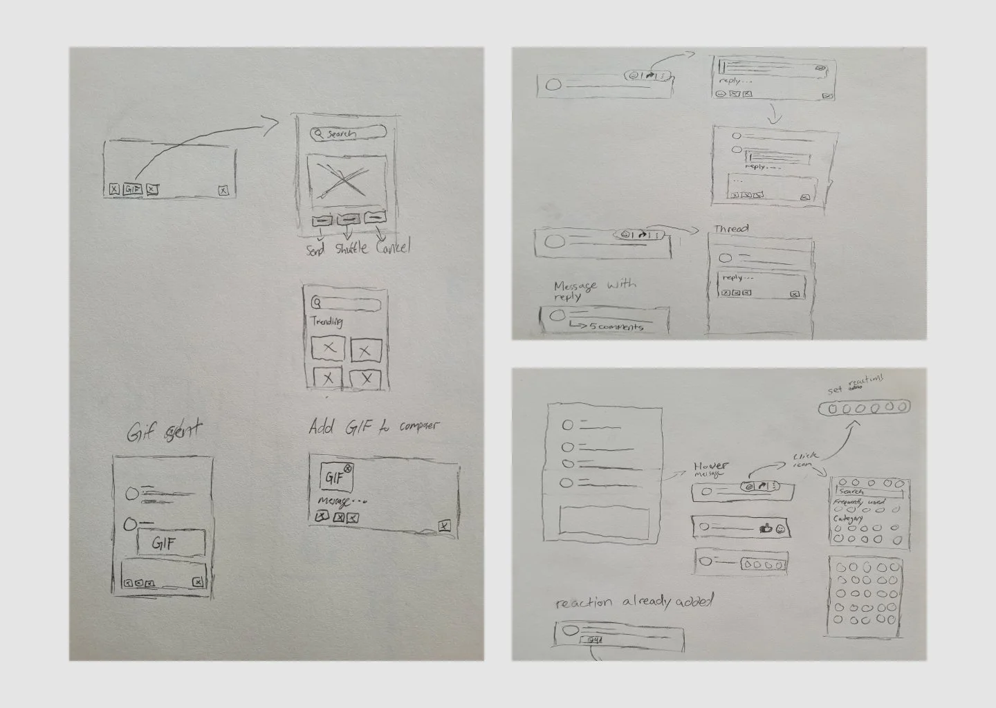
I created simple sketches using elements from the third-party service to outline our vision and feature enhancements. These drafts made it easy to generate a range of ideas.
I shared these initial concepts with my team for feedback. After weighing the pros and cons and making necessary improvements, I advanced to more detailed mid-level wireframes.
Phased release
Given the scale of this project and the addition of several new features, we decided to break it down into smaller projects, each with a unique focus:
Interface Update: update the messaging interface to align with modern standards.
Attachments: introduce the ability for users to attach images, videos, and files.
Reactions: introduce reactions, enabling users to express themselves and acknowledge messages effortlessly.
Replying and Thread Creation: lets users reply to messages and create organized conversations.
Gif Integration: add gifs as a tool for building culture, adding a bit of fun to the messaging experience.
Tab Addition: enhance chat organization and accessibility for our users with tabs.
Interface update
We updated the messaging interface to align with modern standards.
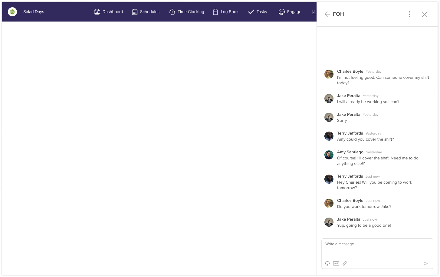
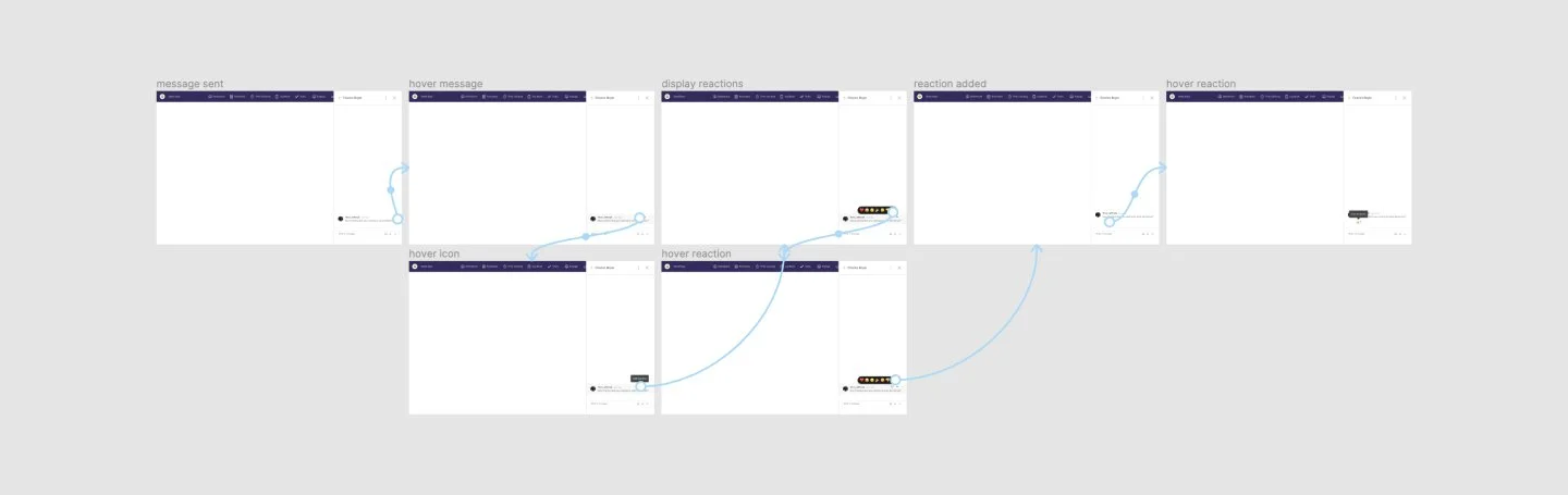
Reactions
This iteration introduced reactions, enabling users to express themselves and acknowledge messages effortlessly.

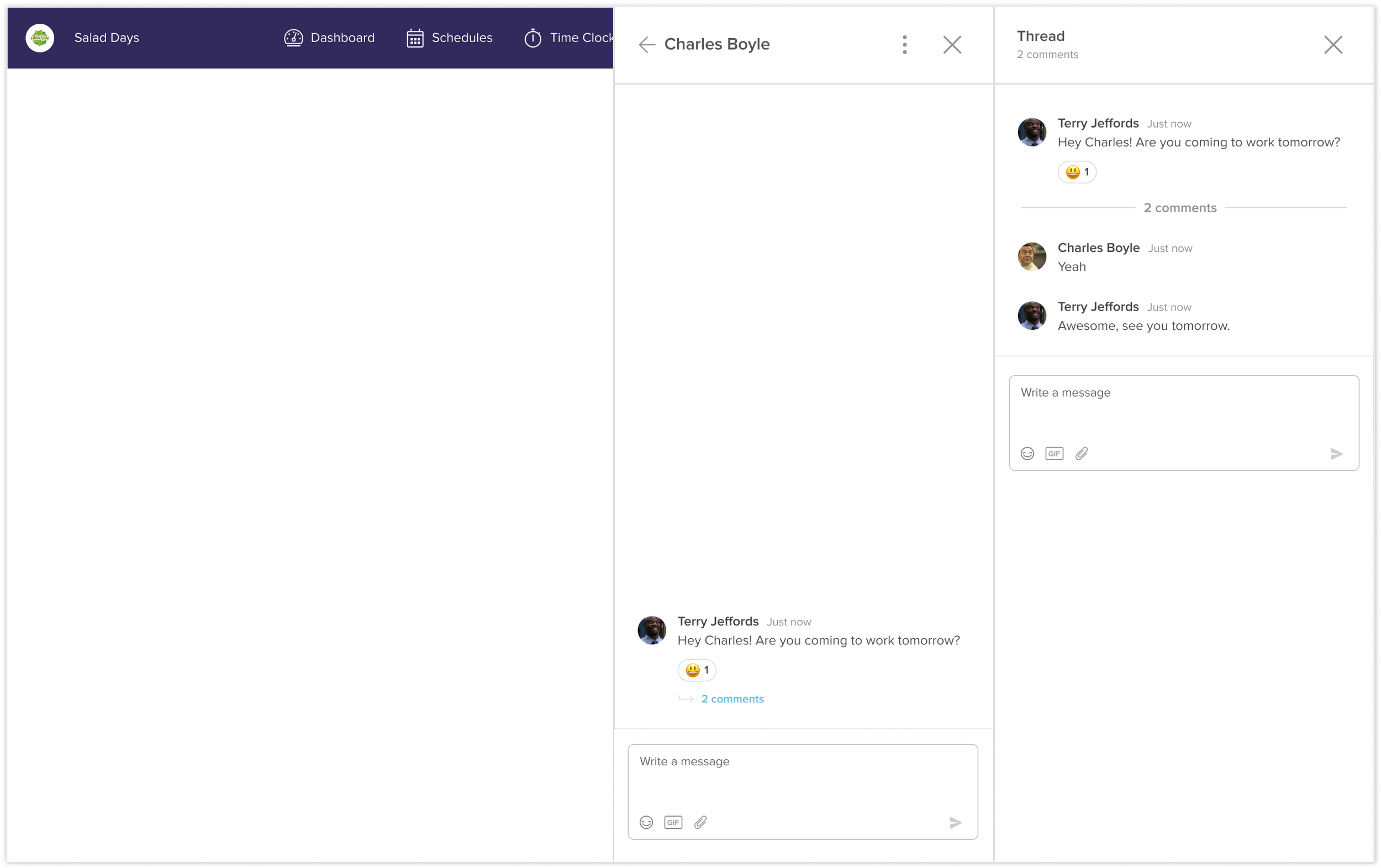
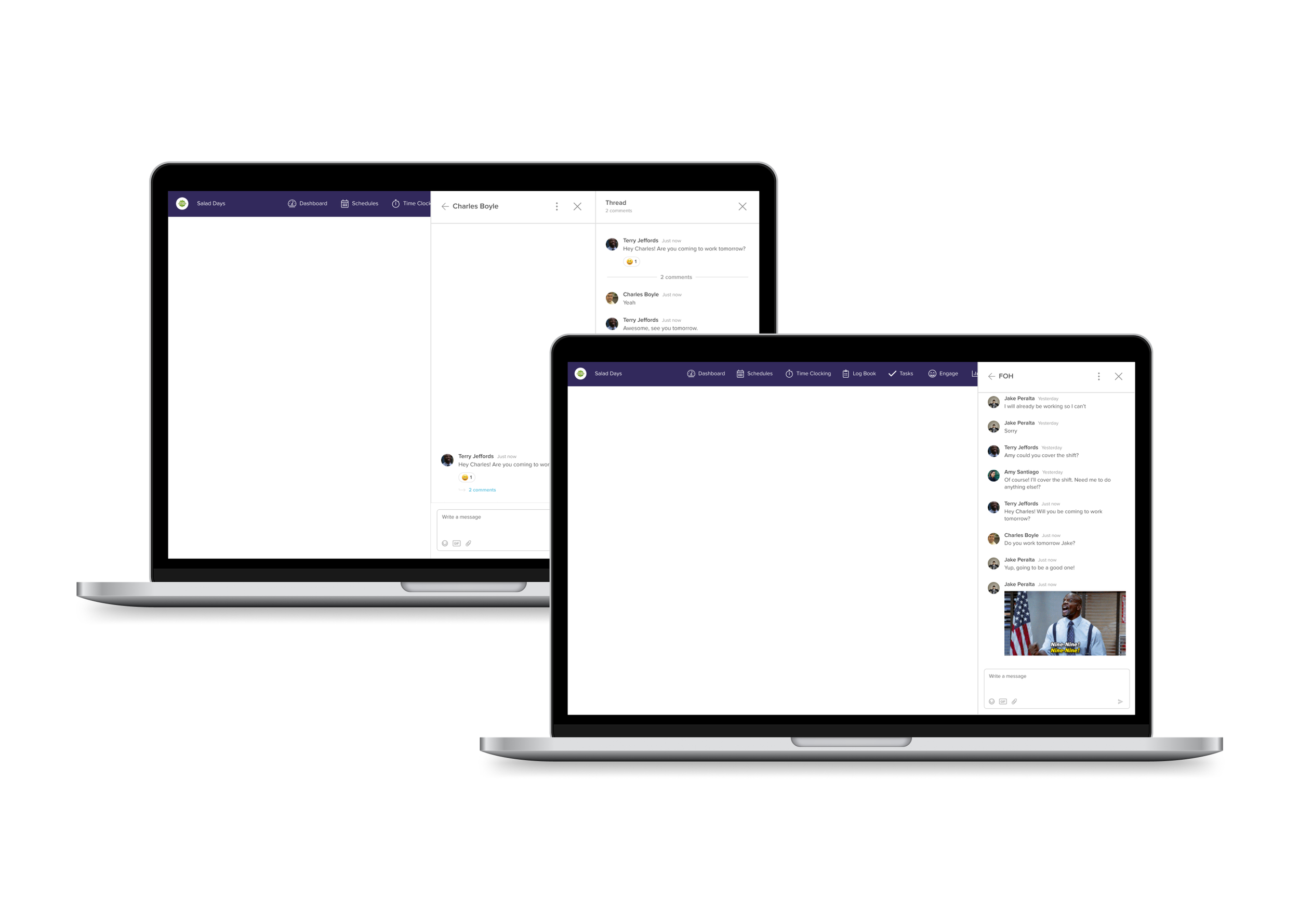
Replying and Thread Creation
This iteration lets users reply to messages and create organized conversations.
We tested both replies and threads with our users and after careful evaluation, we went with threads.
Test
Prototype and User Testing
I created prototypes so we could test the designs with our users. We conducted usability testing and fine-tuned the designs based on the findings. The primary objectives were to assess challenges with discoverability and identify any usability issues.
8
Users
92%
Completion rate
4.7 / 5
Satisfaction score
Implement
Implementation
For each project, I collaborated closely with the developers during the implementation phase. I provided detailed specifications for my designs, answered questions, and assisted with styling. I also carefully reviewed the visuals, tested usability, and checked interactions before each release.
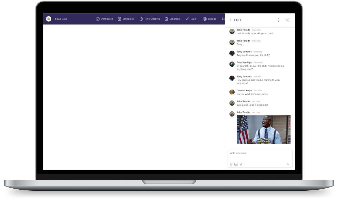
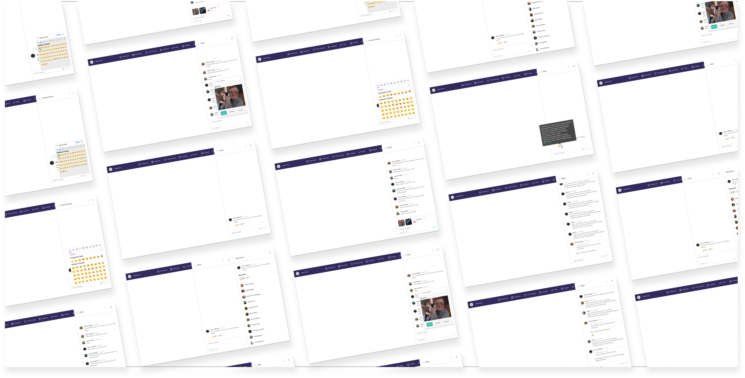
Some final designs
Results
- Improved Messaging Experience: Users now enjoy a more intuitive and modern messaging interface.
- Real-Time Communication: The introduction of real-time messaging significantly enhanced staff coordination and decision-making in the fast-paced restaurant environment.
- Efficient Culture Building: With the ability to reply to messages, add reactions, gifs, and attachments, and create threaded conversations, users can now foster a more organized, cohesive, and fun restaurant culture through their communication.
- Decrease in Negative Reviews: We saw a significant decrease in negative reviews related to messaging.
- Improved Feature Satisfaction: Users have reported an increase in their satisfaction by 40%.
What I learned
Throughout this project, I learned important lessons in time management and cross-team collaboration. As the project spanned multiple teams and their evolving priorities, effective time management was crucial. Ensuring design consistency across teams and platforms was essential for delivering a seamless user experience. I honed my skills in overseeing a junior designer, ensuring that no details were overlooked. Working across various platforms introduced complexities due to distinct interactions and expected behaviors, highlighting the significance of attention to detail and thorough communication.